Okay, so you know how last time my blog was all like 'I've faaaaailed, ah well I don't care. I've FAAAILED! *sob* Nah life is fine', and stuff? Well turns out, life is okay. Not great, but okay. And by okay I mean I passed! And by not great I mean I passed crappily. I did have my talk with Dave over the holidays though and he basically said 'Get a distinction in the next three modules and you can get a distinction overall'. So that's the plan! It'll be easy, right?
...right?
...
Ah, dammit.
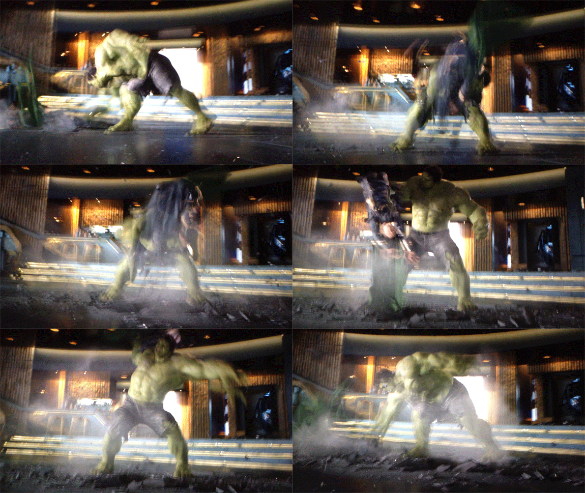
Quick, I need a dose of epic!
Ahaha! That's epic.
Anyway, I've promised to really kick myself up the arse and try to get into good habits with my work. So before breaking into the full-on animatic for my upcoming negotiation module presentation, I decided it was probably a good idea to iron out the setting for my animation which up until this point was sort of accurate... sort of... but it was time to really iron out the kinks. So I had a browse of some old books I had stashed and trawled google for a day or so and came out with about 30 pages of really nice environment images; photographs, a bit of video game concept art as well as one 3D scene from a video game, lots of Avatar screenshots and concepts (but I've not yet got the actual art book for the film from my dad who's lost it), pictures of weeping willows (awesome tree is awesome) and all that rubbish. Feeling my work would be well informed enough, I then set to work to create some concept pieces that in no way resembled anything I'd been looking at. Except for the colour scheme, I suppose.
Here's the first one:
Now, before I say anything else I should probably mention my problem concerning lighting. Simply put, do I do it or not? Here's the flat version without the lighting/shadows:
I like both versions for different reasons. The version with lighting will probably give more atmosphere when characters are moving through it (some cell shading on my vector-silhouette characters could also look quite interesting, it could reveal more of their shape that the viewer doesn't get to see otherwise, and that could be very interesting for the final showdown. Because no villain is a villain until he has evil villainous lighting!)
Unless he's a giant monkey, in which case he'll look villainous even without it. DOSEOFEPIC!
Quick, give him a banana!
Ahem.
So, that's my issue. I do like the plain version though, as the shapes of the trees are more clear. Perhaps if I kept the colours for these areas darker and just added light (the light version actually has a dark haze over it)...
Second concept piece:

Similar issue here. I added a pink haze over the top version to try and show distance and give it a bit of atmosphere, but I'm unsure about whether to keep it or just go with the flat, more brightly coloured version.
I found a slightly better way to do these sorts of pictures, actually, without using the pen tool. As much as I've improved at the pen tool I'm still quite slow with it and I find the lines are a little TOO pristine. What I did with these was take a new layer and draw rough, simplistic line art using a hard brush. Then I added a new layer, selected chunks from the line art layer and filled them in with the fill tool on the top layer. That done, when the line art layer was removed I ended up with a rougher version of the 'vectors' which had white lines where the line art had originally been. I thought it added a bit more randomness when I was messing with the colours (look at the lines on concept 1).
*spends ages clicking around confusedly, because Mac mice are rubbish and tend to confuse a left-click for a right-click. And then get stuck right-clicking and try to copy everything. And yet when I MEAN to right-click nothing ever happens.*
Die, Majin Buu, die!
Ok so anyway. I do need to run this by Dave to be sure I'm not spoiling the vectoriness of it all, but I'm fairly happy. Target time.
Got my presentation on Friday, so here's my lineup:
Rest of Today: Finish written work
Weekend: Begin animatic, finish off presentation and proposal.
Monday-Tuesday: Finish animatic
Wednesday: add placeholder sound effects to animatic
Thursday: Make sure all odd ends are tied up and presentation is ready and organized. Probably panic profusely.
Friday: Presentation, write a boring blog post, plug pictures shamelessly, and write down more targets. Huzzah!
And now, my duckies, I'll leave you with something slightly cuter than giant angry monkeys and dying Majin Buus.
D'aaaw. Bless his face.


